Markup Review
A gallery of websites designed to help designers find inspiration.
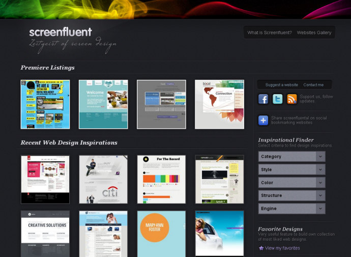
The logo consists of two p elements which means the document is untitled in the document outline. It would work well as a h1/h2 pair inside a hgroup, thereby giving the document a title of “Screenfluent”. There are also quite a few script elements used in the site, all of which have a type attribute. Dropping the type would save a few bytes without any side effects.
3 thoughts on “Screenfluent”
Like the site but screenshots are way too small.
Hi there,
I’m Simon, webmaster of screenfluent. Which screenshots are too small? Thumbnails or those bigger ones when you click? Thanks for feedback, please take your time and post any thoughts on http://getsatisfaction.com/screenfluent
Simon
When you click a thumbnail, it opens up in a lightbox. The screenshot inside the lightbox is way too small. I would make the lightbox about as wide as the site so you can show full size (or very close to full size) screenshots.
Designers like to see details, not some downsized, blurry screenshot.
Good luck with the site!