Markup Review
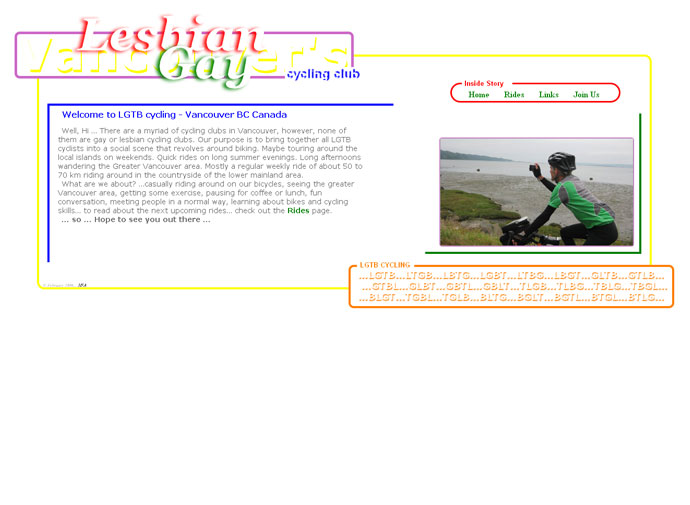
Gay and lesbian cycling club based in Vancouver. The code is well commented so it’s really easy to pick out the new elements used.
_Edit:_ Thanks to Marion’s comment, we’ve spotted that using multiple h1‘s within a hgroup (both at the top and bottom of the page) isn’t really best practice, a single h1 should suffice for this.

4 thoughts on “LGTB Cycling”
I’m sorry but I really can’t seem to understand this choice !
First of all, I’m sorry, but it’s damn ugly 🙁
Ok, I know that this website’s a gallery for html 5 websites, and not for the most beautiful website of the world, but don’t you think that it’s a bit outdated ? At least, make a copy of a wordpress theme if you’re not a webdesigner…
But furthermore, the source code itself is a mess ; well it’s commented, but it’s a generated code ! Watch this meta : ?!! And a in the bottom of the page, near the footer ? Html 5 gallery, I really like you but I’ll pass on that one !
@Marion – Good spot on the markup, I can’t believe I missed that first time round. The use of multiple
<h1>‘s with all those classes is obvisously not the most efficient way to mark up the document. I’ll update the post to reflect this.Oh and you’re right about this site, it’s not really about the design it’s more about the markup.
Cheers
Rich
thanks ,,,, thanks for caring …
design has no boundaries , always pushes forward in funny little ways !
I also did not like the hgroup of h1s , but thought I might put it out there for the hgroup … instead of positioning each word left or right to achieve the effect …. I did what I did … but thanks to your input I rethought and displayed the spans as block , creating a single h1 for both my headers . Thanks
p.s. the footer might be lame but it follows the HTML 5 rules …… doesn’t it ?