Markup Review
A blog with useful articles for web designers.
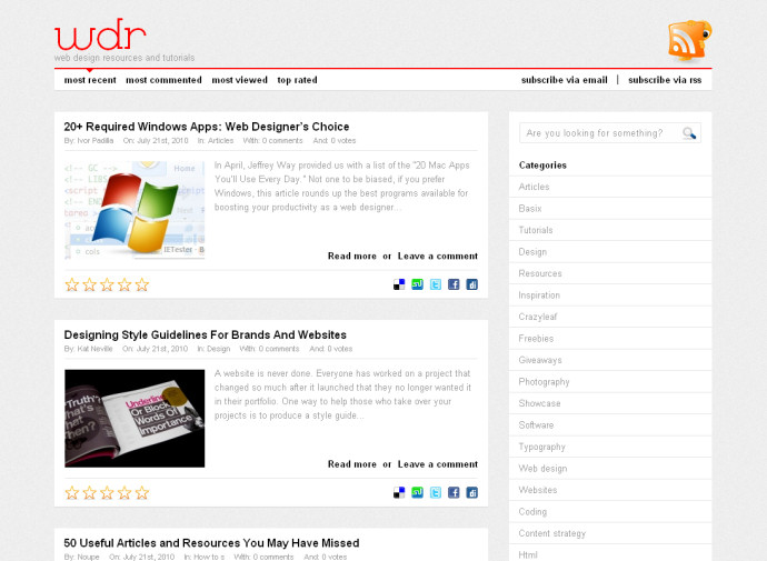
On the homepage an untitled section is used to wrap the article summaries. div would be a better choice for that. The menu in the aside should be changed to nav, as menu is for interactive menus in apps. Each article uses figure to wrap the associated image, but unless the image is essential to understand the article there is no need to use figure.
